RSS 2.0 feed reader sample application that features a swappable reader panel layout.

Complete personal task management application sample that runs on Adobe AIR.
Personal task management application sample that uses Google Gears for data storage.
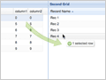
DataView and TreePanel sample that demonstrates dragging data items from a DataView into a TreePanel.
Demonstrates how one could build a desktop in the browser using Ext components including a module plugin system.
A basic read-only grid loaded from local array data that demonstrates the use of custom column renderer functions.
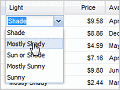
An editable grid loaded from XML that shows multiple types of grid editors as well as defining custom data records.
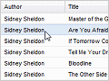
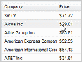
A simple read-only grid loaded from XML data.
A grid with paging, cross-domain data loading and custom- rendered expandable row bodies.
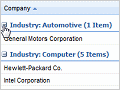
A basic grouping grid showing collapsible data groups that can be customized via the "Group By" header menu option.

Advanced grouping grid that allows cell editing and includes custom dynamic summary calculations.
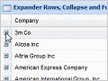
Multiple grids customized via plugins: expander rows, checkbox selection and row numbering.

Grid plugins providing custom data filtering menus that support various data types.
Custom GridPanel extension that can convert a plain HTML table into a dynamic grid at runtime.
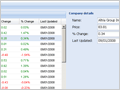
Data binding a grid to a detail preview panel via the grid's RowSelectionModel.
Refactoring the basic data binding example to use a class-based application design model.
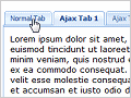
Basic tab functionality including autoHeight, tabs from markup, Ajax loading and tab events.
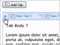
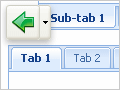
Advanced tab features including tab scrolling, adding tabs programmatically and a context menu plugin.
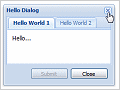
Simple "Hello World" window that contains a basic TabPanel.
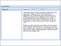
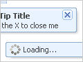
Different styles include confirm, alert, prompt, progress and wait and also support custom icons.
A window containing a basic BorderLayout with nested TabPanel.
A TreePanel loaded asynchronously via a JSON TreeLoader that shows drag and drop with container scroll.
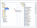
Drag and drop between two different sorted TreePanels.
A custom TreePanel implementation that demonstrates extending an existing component.

A custom TreeLoader implementation that demonstrates loading a tree from an XML document.
Includes examples for each standard Ext layout, several custom layouts and combination examples.
A complex BorderLayout implementation that shows nesting multiple components and sub-layouts.
A simple example of anchoring form fields to a window for flexible form resizing.
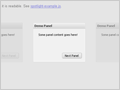
A page layout using several custom extensions to provide a web portal interface.
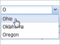
Basic combos, combos rendered from markup and customized list layout to provide item tooltips.
Customized combo with template-based list rendering, remote loading and paging.
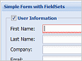
Various example forms showing collapsible fieldsets, column layout, nested TabPanels and more.
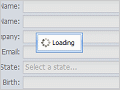
Ajax-loaded form fields from remote XML data and remote field validation on submit.
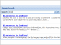
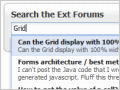
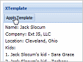
A TriggerField search extension combined with an XTemplate for custom results rendering.
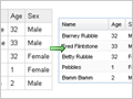
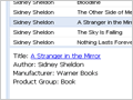
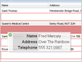
A grid embedded within a FormPanel that automatically loads records into the form on row selection.

Relational form field validation using custom vtypes.
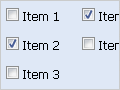
Many examples showing different checkbox and radio group configurations.
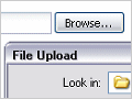
A demo of how to give standard file upload fields a bit of Ext style using a custom class.

Example controls for selecting a list of items in forms.
Toolbar and menus that contain various components like date pickers, color pickers, sub-menus and more.
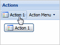
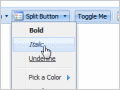
Bind the same behavior to multiple buttons, toolbar and menu items using the Ext.Action class.
A simple example of rendering views from templates bound to data objects.

A basic DataView with custom plugins for editable labels and drag selection of items.
A more customized DataView supporting sorting and filtering with multiple templates.
A simple drag and drop from grid to grid implementation.
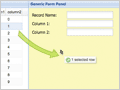
A basic drag and drop from grid to formpanel.
Enabling drag and drop between a DataView and a grid using DragZone and DropZone extensions.
A History manager that allows the user to navigate an Ext UI via browser back/forward.
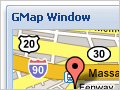
A Google Maps wrapper class that enables easy display of dynamic maps in Ext panels and windows.
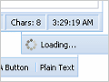
A simple StatusBar that can be dropped into the bottom of any panel to display status text and icons.
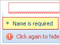
Customizing the StatusBar via a plugin to provide automatic form validation monitoring and error linking.
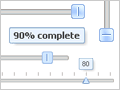
A slider component that supports vertical mode, snapping, tooltips, customized styles and more.
Various tooltip and quick tip configuration options including Ajax loading and mouse tracking.
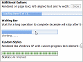
A basic progress bar component shown in various configurations and with custom styles.
A basic collapsible panel example.

Examples of making any element resizable with various configuration options.
A utility for masking everything except a single element on the page to visually highlight it.
Demonstrates fully localizing a form by including a custom locale script.
Dynamically render various Ext components in different locales by selecting from a locale list.
 Ext 2.2 -